Graphical Integrity in Data Visualisations
This infographic, highlighting quirks of the UK voting system, recently popped up in my Twitter feed. Whilst the accompanying article makes some valid points, the graphic is rather inaccurate.
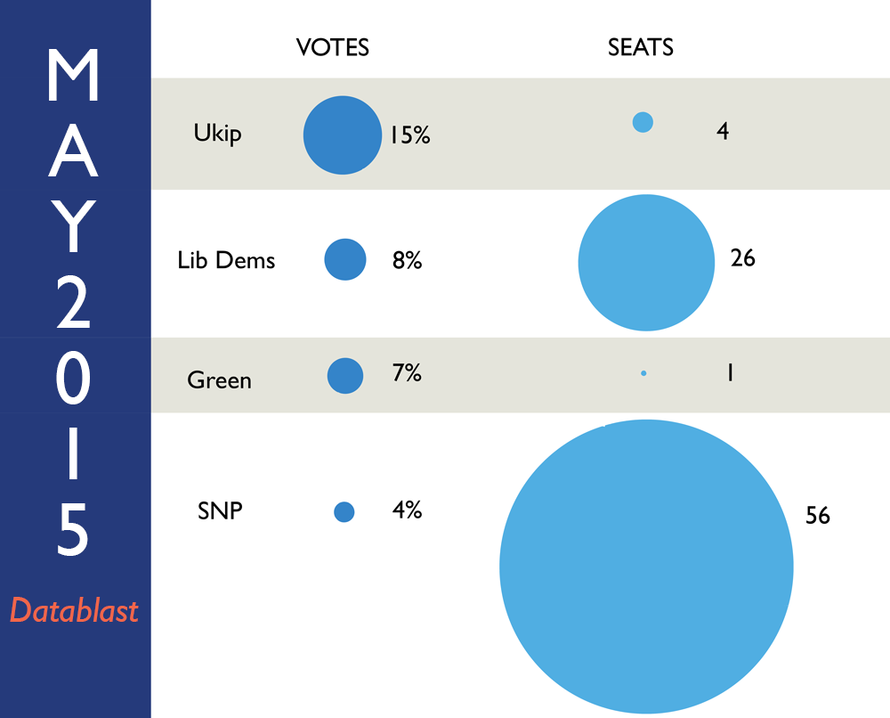
Firstly, it uses circles (of two dimensions) to represent one-dimensional data. Edward Tufte discusses this in The Visual Display of Quantitative Information:
There are considerable ambiguities in how people perceive a two-dimensional surface and then convert that perception into a one-dimensional number. Changes in physical area on the surface of a graphic do not reliably produce appropriately proportional changes in perceived areas.
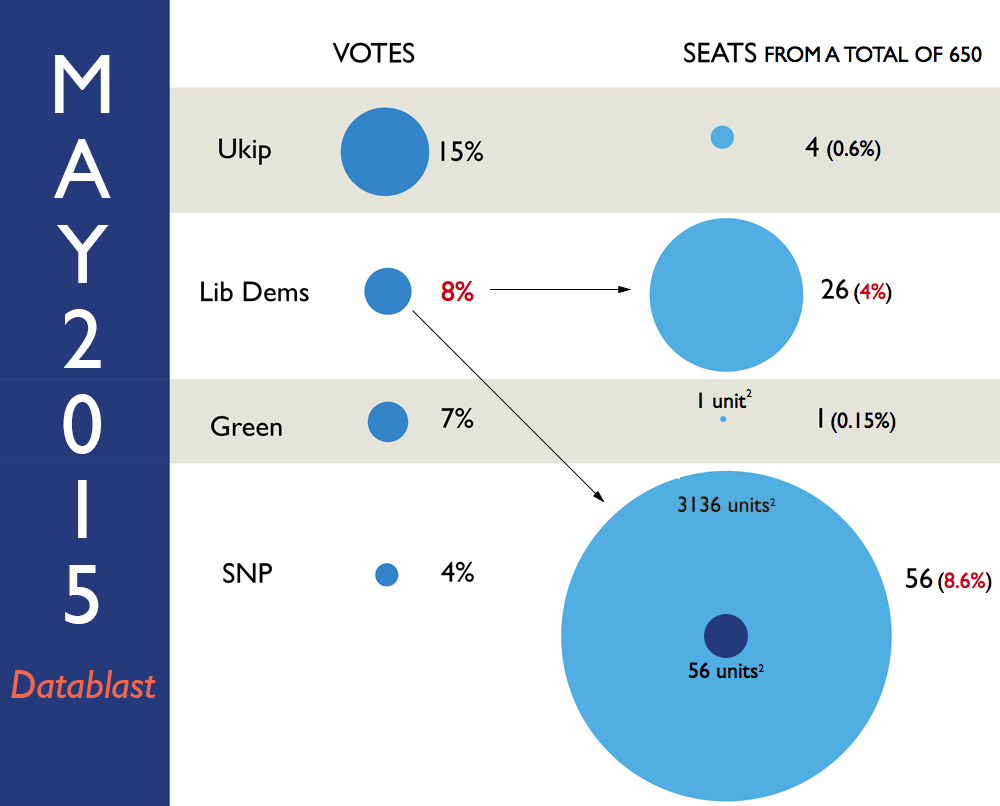
In this instance, the designer has varied the radius/diameter of the circles, which results in a surface area that exaggerates the data. For example, compare the circles for the Green Party and the SNP. If the Green Party circle represents 1 unit-squared, then you’d expect the SNP’s circle to be 56 units-squared. Instead, it is 3136 units-squared—56-times greater than it should be.
Secondly, it encourages comparisons between values on different scales: percentage of votes, and number of seats.
The graphic gives the impression that the Lib Dems gain considerably from the voting system: 8% votes → 26 seats. 26 seats actually represents just 4% of the total seats (650), so their votes are effectively halved! This distortion is also observed when comparing the Lib Dems’ “votes” circle to the SNP’s “seats” circle. The SNP’s 56 seats (8.61%) should be comparable to the Lib Dems votes (8%). It isn’t.
What’s more, there is a second graphic (not re-published here), making the same votes-to-seats comparisons but with the Labour, Conservative, and Ukip parties. However, this is on a different scale to the previous one, making any further comparisons impossible.
It would be more accurate to make comparisons based on percentages of seats, and include all the data in a single graphic. Perhaps a simple table would suffice?
The following table attempts to convey how much each party is set to gain/lose because of the voting system based on the forecast. A ratio greater than 1 indicates that a party gains from the system; ratio less than 1 indicates that a party loses from the system.
| Party | % of Votes | % of Seats |
Ratio
% Seats / % Votes
|
|---|---|---|---|
| Labour | 33 | 42.31 | 1.28 |
| Conservatives | 31 | 40.92 | 1.32 |
| Ukip | 15 | 0.62 | 0.04 |
| Lib Dems | 8 | 4.00 | 0.50 |
| Green | 7 | 0.15 | 0.02 |
| SNP | 4 | 8.62 | 2.15 |
Ratios can be transformed into “Advantages” by taking logarithms: positive values indicate gain, negative values indicate loss.
| Party | % of Votes | % of Seats |
Advantage
log2(% Seats / % Votes)
|
|---|---|---|---|
| Labour | 33 | 42.31 | 0.36 |
| Conservatives | 31 | 40.92 | 0.40 |
| Ukip | 15 | 0.62 | -4.61 |
| Lib Dems | 8 | 4.00 | -1.00 |
| Green | 7 | 0.15 | -5.51 |
| SNP | 4 | 8.62 | 1.11 |
From these tables we can deduce that:
- Labour and the Conservatives are set to gain a little from the voting system
- The SNP would gain as much proportionally as the Lib Dems lose: the voting system effectively doubles the SNP’s seats, and halves the Lib Dems’
- Ukip and the Greens are set to lose out the most, significantly more than any other loses or gains
Got feedback? Email me: [email protected]