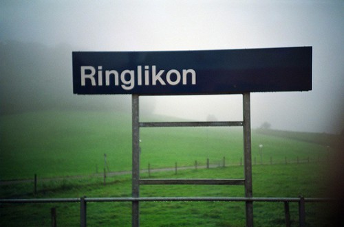
Helvetica (2007)

I finally got round to watching Helvetica, a film that documents various designers' thoughts on the typeface, along with a bit of history surrounding modern design.
Towards the beginning of the film I was quite surprised by some of the designers' feelings towards typography, and the way they advocate Helvetica's use:
[Helvetica] was doing away with manual details. We were impressed by that, because it was more neutral, and neutralism was a word that we loved. [Type] should be neutral. It shouldn't have a meaning in itself. The meaning is in the content of the text, not in the typeface. That's why we loved Helvetica very much.
Wim Crouwel
Massimo Vignelli worked on the American Airlines branding, and the signage of the New York subway:
There are people that think that type should be expressive … I don't think type should be expressive at all. I can write the word dog with any typeface and it doesn't have to look like a dog, but there are people that when they write dog it should bark!
It is a modern type. It is a very clear type. It's good for everything, pretty much.
You can say ‘I love you’ in Helvetica. You can say it with Helvetica Extra Light, if you want to be really fancy. You can say it with the Extra Bold if it's really intense and passionate, and it might work!
Massimo Vignelli
I feel that every typeface always expresses some meaning however it is used, and that choosing typefaces requires careful consideration. After all, all typefaces have been created by someone and for some reason, and many have a deep history behind them, which is partly the reason why ‘Keep Calm and Carry On’ set in Helvetica (below right) just looks wrong (to my eyes, at least). Helvetica is a hugely versatile typeface and can be very expressive as Vignelli explains(!), but I don't feel it is right for everything.
Below: For want of a better example: ‘Keep Calm and Carry On’ set in Gill Sans (left) and Helvetica (right). Neither use the typeface of the original.

The film moves on to examine the use of type in post-modern design, grunge, and rebellion against using Helvetica without question, which includes this great piece from David Carson:
The film then settles on interviews with younger designers and their opinions on working with Helvetica today.
For me, Helvetica is a great typeface and is fit for many applications: I've often fallen into the trap of trying to find something similar to Helvetica for the sake of not using Helvetica, when Helvetica has been perfectly suitable all along. As a web designer, typeface choices are beginning to open up with the availability of web fonts, but their use can be a performance concern:
Hey everyone, can you please stop with web fonts on mobile experiences? I'm tired of seeing a blank page for the first 5 seconds.
— Nicholas C. Zakas (@slicknet) April 14, 2012
… which makes the choice even harder.