Rails Redesign
I can’t help but feel a little disappointed by the new Ruby on Rails site launched last year. It’s undoubtedly more up-to-date, but gone is the emphasis on fun and friendliness, and in its place, a focus on business and making money.
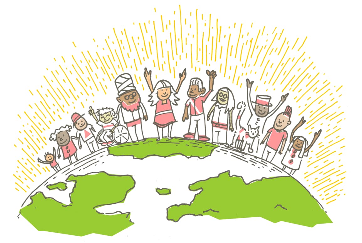
Aside from the removal of the happy handdrawn cartoons, the contrast in copy is revealing. Where previously it opened with:
Imagine what you could build …
Learning to build a modern web application is daunting. Ruby on Rails makes it much easier and more fun. It includes everything you need to build fantastic applications, and you can learn it with the support of our large, friendly community
(Emphasis my own.) It now reads:
Compress the complexity of modern web apps.
Learn just what you need to get started, then keep leveling up as you go. Ruby on Rails scales from HELLO WORLD to IPO …Over the past two decades, Rails has taken countless companies to millions of users and billions in market valuations.
Happiness does get a mention, but sadly it’s the last thing mentioned, and feels lost amongst the business spiel.
For Rails apps themselves, the start up graphic has also been removed and I will certainly miss this happy scene 🥲
